A premium real estate brand focusing on modern apartment living and investment opportunities.
Introduction
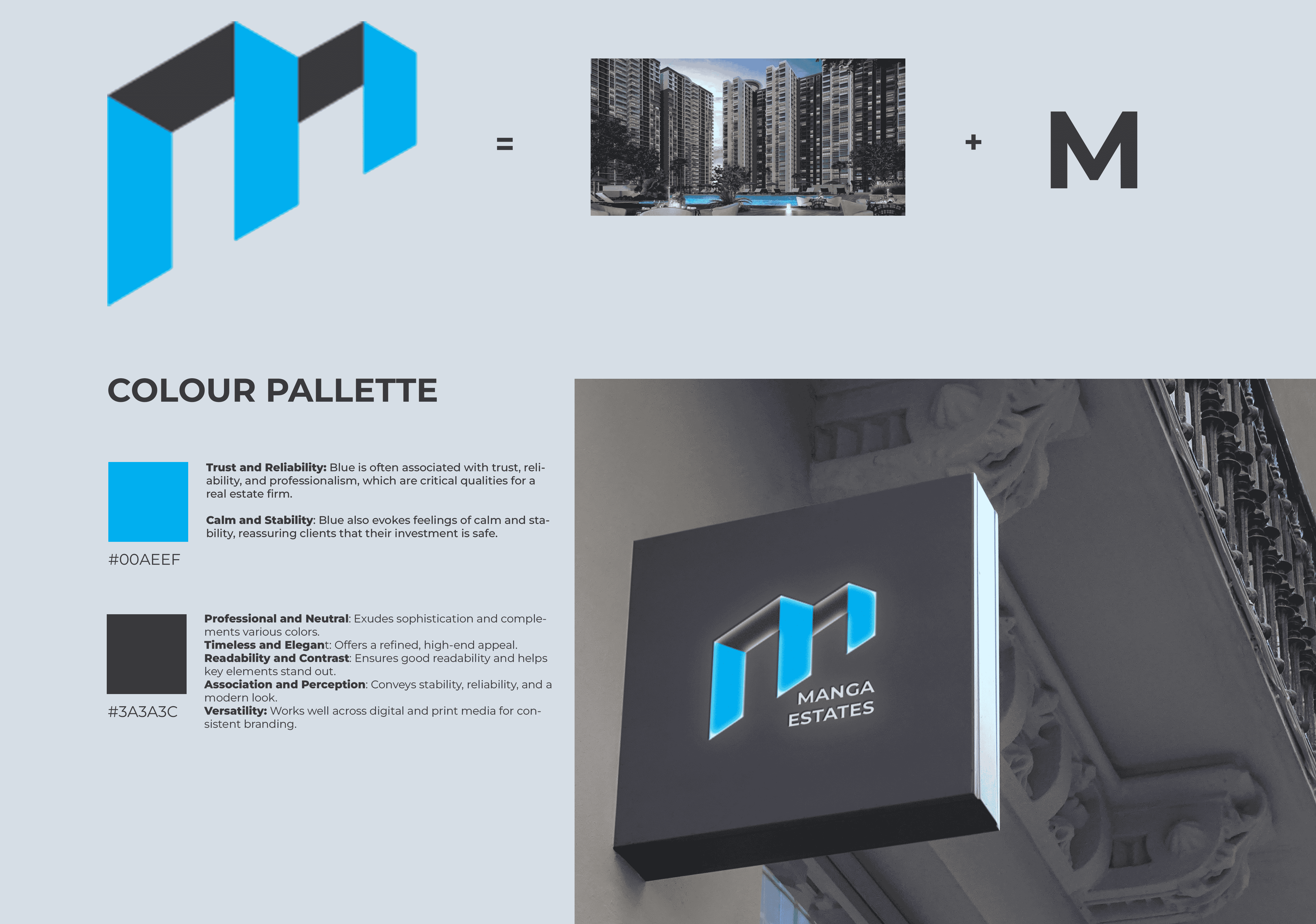
Project Objective: To design branding that highlights trust and professionalism while educating and raising awareness about investments in tier 2 and tier 3 cities.
Brand Colors and Typography
Color Palette :
Blue (#00aeef): Symbolizing trust and dependability.
Dark Grey (#3a3a3c): Representing professionalism and modernity.
Typography:
Font: Montserrat – A modern sans-serif typeface that conveys clarity and approachability.
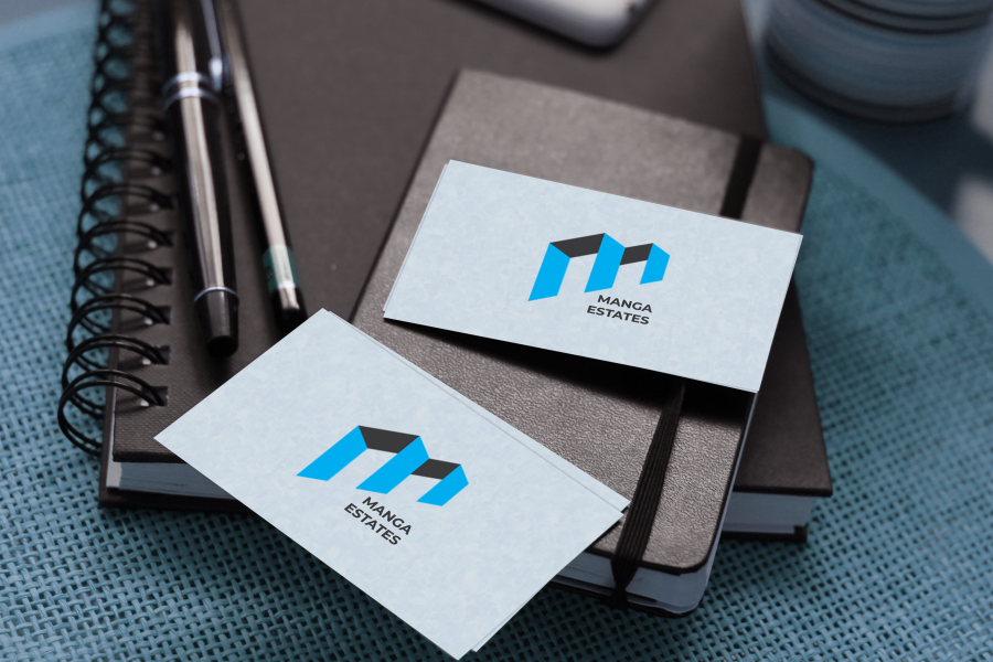
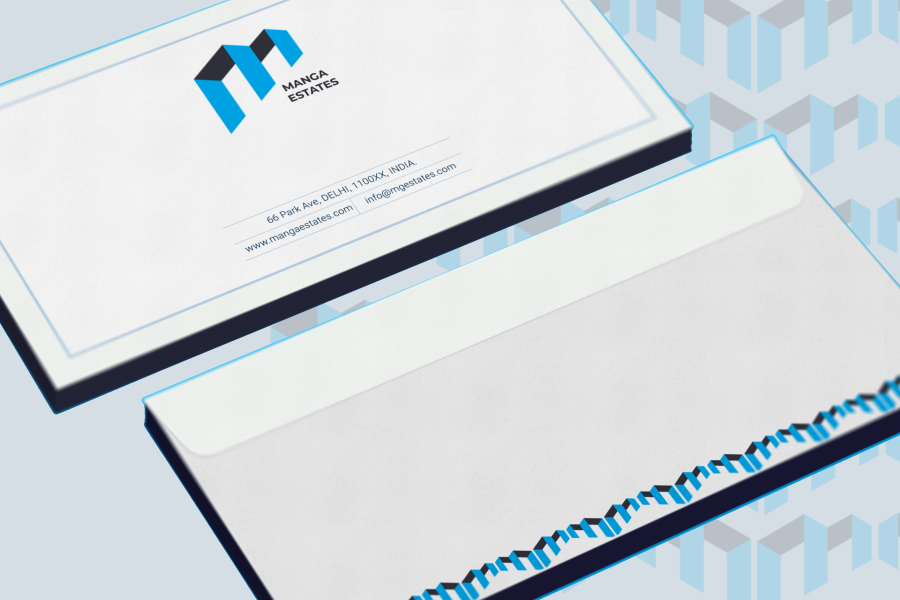
Logo Design
Concept:
Inspired by modern apartment building designs, reflecting real estate and urban living.
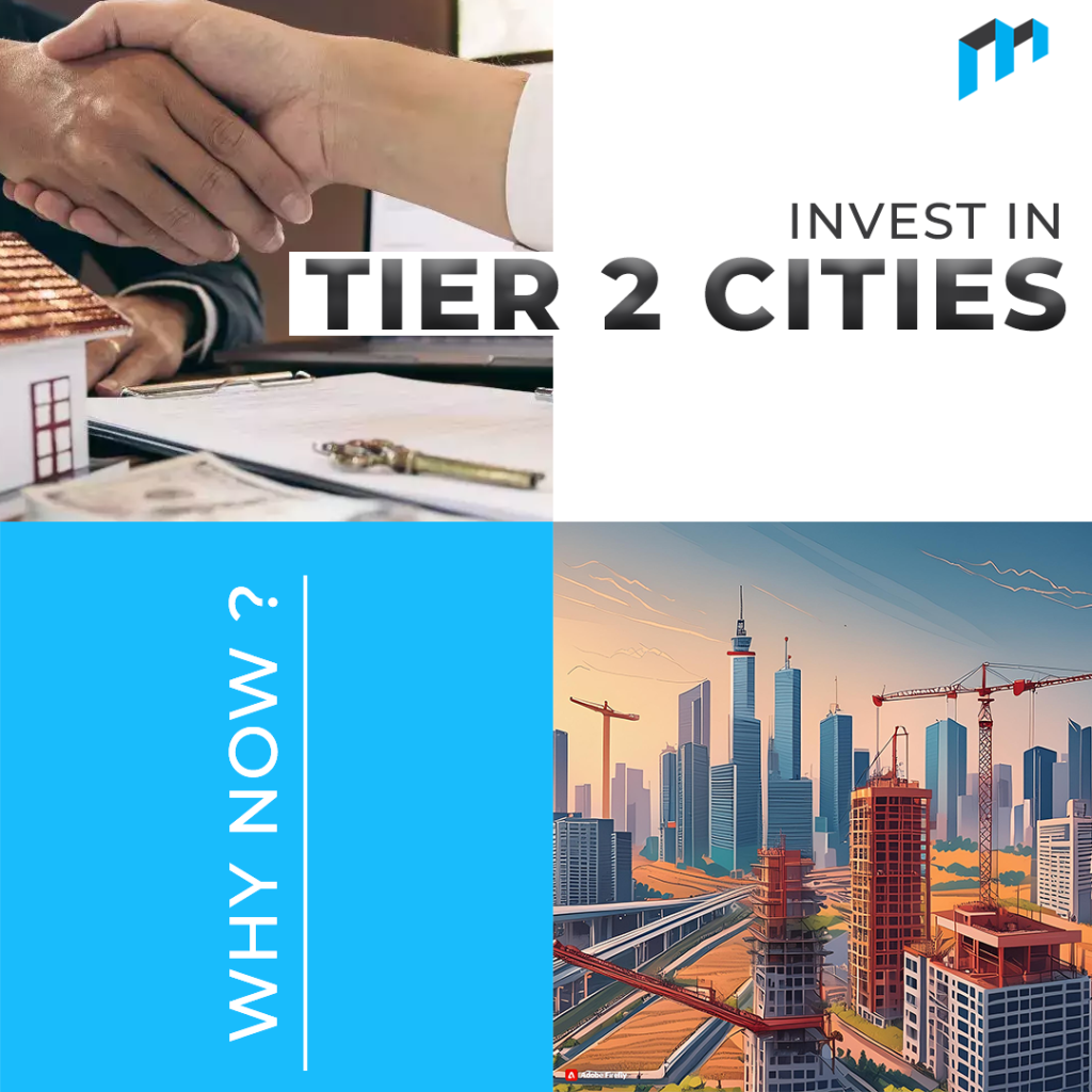
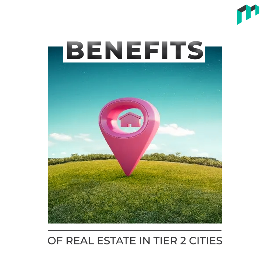
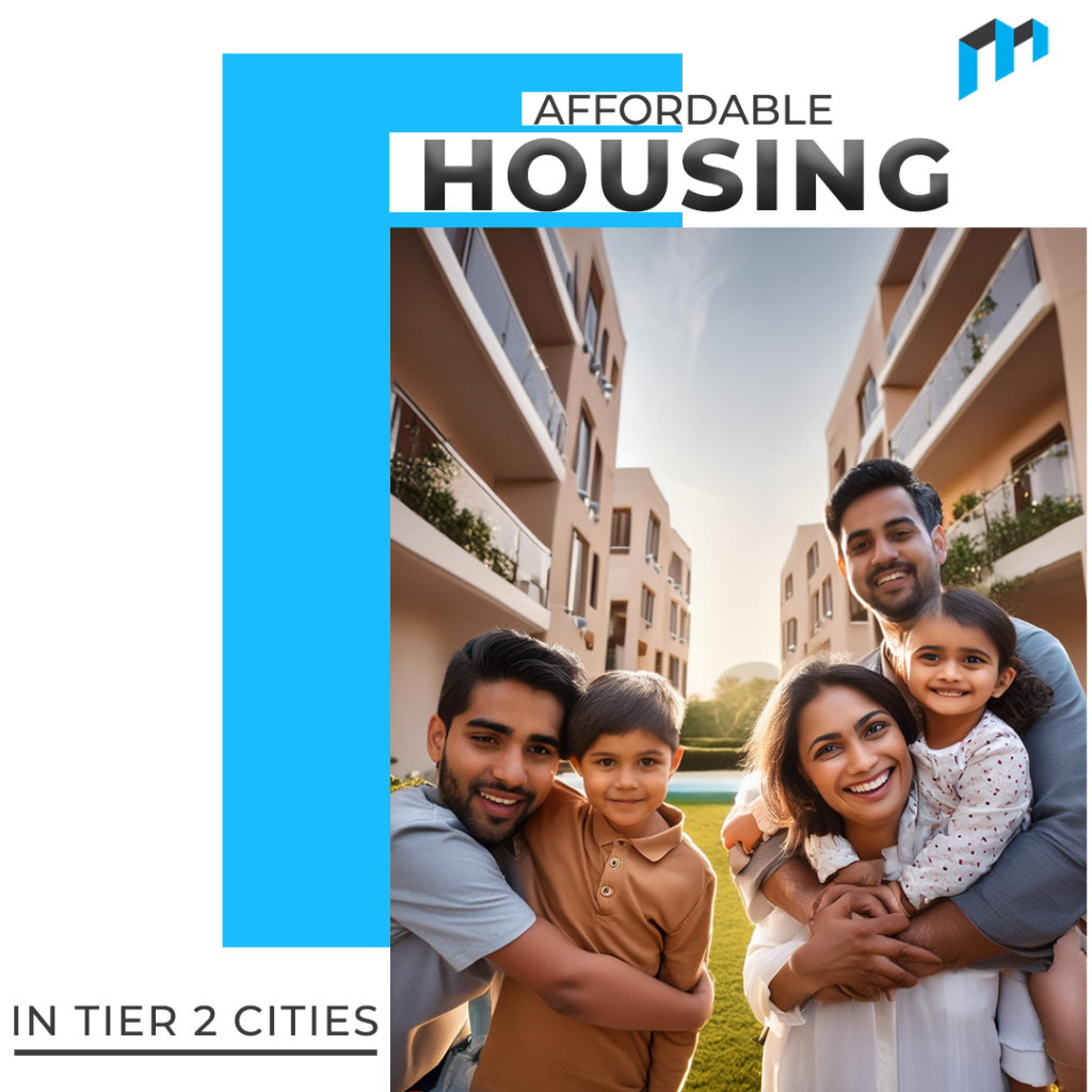
Social Media Feed
Purpose:
Educate and spread awareness about the potential of investing in tier 2 and tier 3 cities.